Characteristics of Warm, Neutral, and Cool Skin Tones
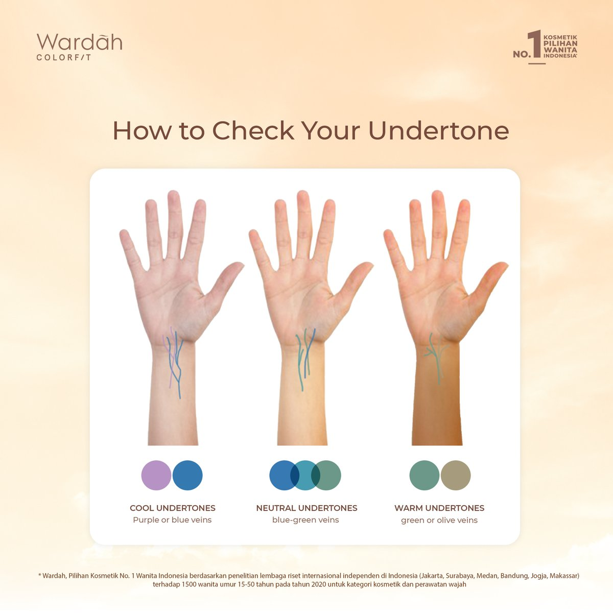
You’ve probably heard the terms warm tone, neutral tone, and cool tone, but what are they? These refer to the undertones of a skin, and determine the color that best matches. For instance, people with warm skin tones look best in gold jewelry, people with cool skin tones look best with silver, and people with neutral tones look good in both. Another way to determine your own undertone is to look at the veins in your wrist. What color are they? Do they look more green/olive, blue-green, or purple/purple-blue? Understanding your undertone is key to choosing the right colors for you. And knowing the tone of your subject will help you accurately create their true color.
Finding a Base Color
Now that you know what undertones are and how to find them, you now have to learn how and when to use them. When starting a drawing, I find it works best to find two base colors. The first base color is a pure undertone, this will help that undertone show through in the final product. The second, is what I call the average tone. It is the color that you would use if you were making a one shade drawing. This will help you choose colors that work well to create the final tone. The key to using these colors is to lightly shade in the whole face (or body) with both colors. It is extremely important to not color too dark, especially if it’s a light skin tone. If you are using a medium such as colored pencils, if you shade too dark at the beginning, you can’t add more color on top.

Ivory to Light Skin Tones
Typically, if you have a lighter skin tone, you will either be cool or neutral undertone, although that is not always the case. With this, make sure that the colors you are using are muted. Don’t use highly saturated colors, or it will appear too dark. When shading fair skin tones, the shadows will be created using soft pinks and purples, rather than browns. The closer you get to “Light” skin tone, the more you can add peached and light tans. Or you can use peaches and tans if the subject is a very warm undertone. The column on the left of this photo displays light to medium tones. The top row being cool, the middle being warm, and the bottom being neutral. This type of guide is useful when finding a base color.
Medium to Bronze Skin
Depending on the undertones you will use different colors to shade. Rather than using gray or black to add shadow, use higher saturated versions of the colors there. For example; if you are coloring a caramel skin tone and you are coloring the crease in the eye, you could use a dark red/rust color. And if it looks too bright, take the average tone color you found earlier, and go over it a little bit. For highlights, rather than using light pinks as you would on cool skin tones, use light golds, little details like that are what make a picture. This middle skin tone range has the most varied shades of them all. So always consult your reference and draw your own conclusion, there is no one guide that fits all skin.
Deep/Black Skin Tones
The darker the skin tone you are making, the more vibrant colors you can use. In addition I the undertone variety is fairly even in darker skin tones. For example; if you are coloring a skin tone similar to the Fenty Beauty by Rihanna foundation in shade 495 – which is for cool undertones – you can use purples to shade the darkest shadows. If you are shading a dark neutral tone, maroon can be a good choice, as it is both warm and cool. If you are ever in doubt though, just look at your reference picture. I find it is easiest to zoom up very very close, that way my brain isn’t projecting what colors it thinks should be on a face. I can instead analyze the true color.

Lips
Lips can be difficult to tackle. I like to start by finding the grayscale shade. Most lips will be about 2-5 shades darker than the rest of the skin. Although, with some dark skin tones, people have something called two tone lips (as pictured below). Where their top lip is a dark color – typically brown, and the bottom lip is pink. A way to find this is to put your reference in black and white, and see how much darker the lips are. From there you can pick a color in that same grayscale shade zone. Keeping in mind if it is a cool, warm, or neutral tone. From there use the same techniques as the rest of the face, start with a base shade and then shadows.
Another thing to remember is shadow placement. The top lip faces downward, so it will be darker than the top of the bottom lip, which is facing the light. There are also shadows at the corners, and the line where the two lips meet. But there will be highlights at the top/middle section of the bottom lip, and at the edge of the cupid’s bow area.

Finishing Touches and Tips
There are many areas of the face which are highlighted. Obviously the high points, such as the tip of the nose and tops of the cheeks, but also in an area called the T-zone. The T-zone is a T shaped area of the middle of the face that gets oil, this will cause natural highlights. Another area to remember is right around the nostril as oil collects there. So rather than shadowing the crease on the outside of the nose, highlight it, and shadow the actual nostril.

And finally, here below is a skin tone palette I made.
